
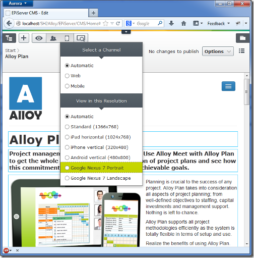
Adding a new device to the view resolution drop-down
In the new and shiny EPiServer 7 user interface there's a feature for changing the size of the preview view port. This is intended to give the editor a quick way of visualizing a page as it would turn out when shown on a smaller screen. A few devices are set up in the Alloy Templates project, and it's very easy to add your own.
One popular device these days is the Google Nexus 7 tablet, so let’s add a preview option for it to the preview resolutions drop-down.
Looking at the hardware specs we can see that the native display resolution on the Nexus 7 is 1280 by 800 pixels, but we can't however use these values straight away. The reason is that most high resolution mobile devices apply scaling and actually report different screen dimensions than the physical ones. The iPhone4 for instance, reports the same screen dimensions as the iPhone3 even though its display sports 4 times as many pixels. Therefore we have to figure out which resolution the device actually reports to get as close as possible to reality. An easy way of figuring this out is to pay this screen size test page at quirksmode.org a visit with the device in question and check the reported window width and height. For the Nexus 7 in portrait mode we get a reported canvas size of 600 by 790 pixels, and in landscape mode 960 by 440 pixels. The difference in width/height between the different modes is caused by soft buttons and browser chrome (location bar and tabs).
Now when we have this information we can add a couple of new options to the resolution section of the view drop-down by implementing the interface EPiServer.Web.IDisplayResolution. In the Alloy template project there's already a base implementation of this interface, EPiServer.Templates.Alloy.Business.Channels.DisplayResolutionBase, making it really easy to add new display resolution alternatives to the view drop-down. All you have to do is inherit the base class and supply the name and dimensions to the base constructor.
public class Nexus7PortraitResolution :
    EPiServer.Templates.Alloy.Business.Channels.DisplayResolutionBase
{
    public Nexus7PortraitResolution() :
        base("Google Nexus 7 (Portrait)", 600, 790) { }
}
Now build and reload and you should have a new display resolution option available.
Adding a backgroud device image
If you inspect the html structure around the preview iframe you'll notice an auto generated css class named epi-viewPort-600x790, where the numbers correspond to the dimensions specified in the definition above. So all we have to do is to define this css class to customize the look of the view port, and assuming we're in the Alloy sample project, we add a new CSS file, ClientResources/Style/displayresolutions.css, with the following contents:
.epi-viewPort-600x790
{
    background: url('../images/nexus7.png') no-repeat center center;
}
The nexus7.png referenced in the css class above is a background image picturing the Nexus 7, and is shown behind the scaled down view port. (A big thanks to my dear colleague Micke Alm who provided the image)
To get this css file loaded when the ui loads we're going to piggy-back on the cms module's resource bundle. Knowing that the CMS module depends on a resource bundle named epi.cms.widgets.base we can add our css file to this resource bundle from the module.config of our project.
<clientResources>
    <add name="epi.cms.widgets.base" path="Styles/displayresolutions.css"
         resourceType="Style" isMinified="false" />
</clientResources>
Now our displayresolutions.css file will be loaded whenever the cms module is started, i.e. when going to edit mode in CMS 7.
Keep in mind that there's no file watch on module.config so changes aren't picked up automatically by the application. Therefore you'll have to touch web.config or restart the application by other means to see the changes on the site.
We should now be able to select Nexus 7 in the resolution drop down and get the preview as shown below, with the browser preview to the left and the actual rendering to the right for comparison.
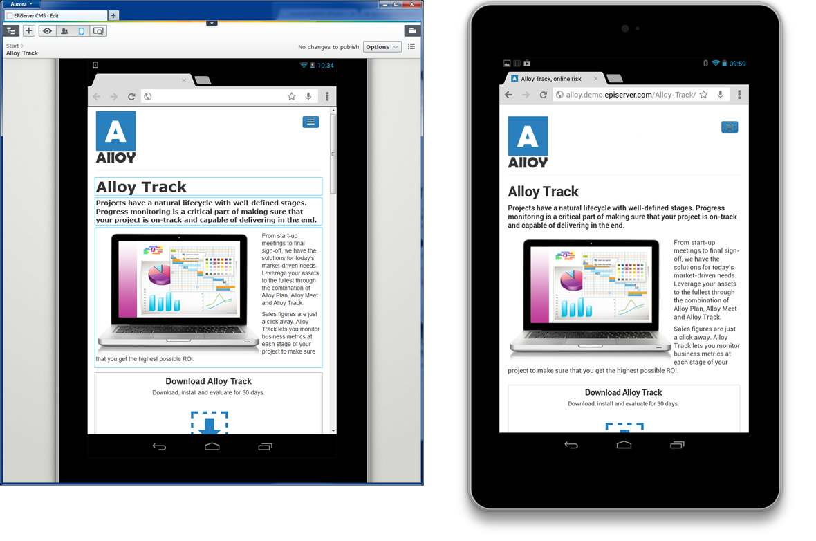
While this approach of course doesn’t give the exact same result as on the actual device, it can give the editor a fairly accurate idea of how a page will look on a different screen.
Comments