
Five things developers need to start doing now to make editors happy!
Over the years I've seen many implementations of Episerver and one thing that has been consistent is developers tending to forget about the Editor. You know, that person who will wind up using the product.
Sometimes it's an inherited project from an inexperienced partner or customer that decided they could do it all themselves… after all Epi is just .net isn't it? I’ve heard from customers that the product is terrible and difficult to use. What? Those are exactly the opposite points of why anyone would buy Epi. When we look under the hood we can find bad examples of content types, poor UI and rushed decisions.
At Made to Engage, when we train backend & frontend developers on Episerver we always include a module on designing for the Editor. Bad habits can stick though, so we regularly need to review and check best practices are followed.
Here's a checklist I made to make sure what we are building is a good product for Editors.
1. Use clear names and descriptions for all your content types
This one should be fairly easy to do, yet I’ve seen plenty of projects that have screens like this!
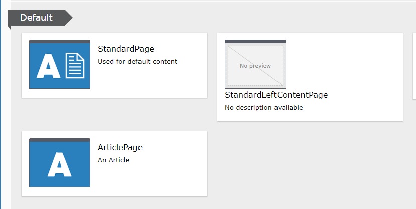
While ArticlePage is just a bit lazy, what the heck is StandardLeftContentPage?
Episerver has the Display Name and Description properties for your content type attribute to make this editor friendly. These can also be localized when you have editors in multiple languages. The same rules apply for Blocks too.
The Description should be in line with the intended usage of the page.
For example:
Article Page
This page is for Press releases and corporate information.
2. Have relevant iconography
And while we are here did you notice the use of Alloy icons? Is it just me or do these seem to be the same icons we see on every project? They make sense on Alloy because that is the brand of the company! At the very least you should come up with a thumbnail icon for the brand of the customer site.
The icons are meant to indicate the usage of the Page or Block, so more specific icons are helpful for the editor to spot the right content type quickly.
And never ever release a type without a thumbnail icon. You could spend weeks delivering the functionality for that specific content type and yet it will look unprofessional and rushed if you skip this detail.
3. Fully utilise on page editing
Sometimes there are settings for a Page or Block that you need to go into the All Properties view to properly edit, like the number of items to display on a Page Listing block for instance.
However, you should try to make the On-Page Edit view the easiest way for editors to make changes to the majority of properties because this is the most natural way of understanding what those changes will look like.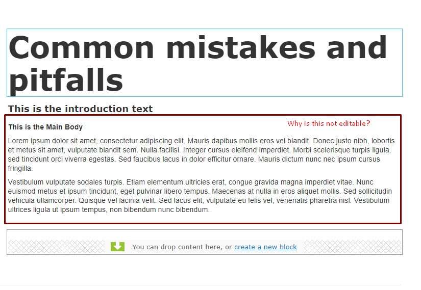
As a rule of thumb anything in the Content tab should be available in the On-Page Edit view. If it doesn’t fit in there it’s likely to go in Settings or a custom tab name.
4. Avoid nesting of blocks where possible
Here’s one that frustrates editors to no end. They want to do something simple but in order to do so they have to click through several layers of blocks.
Adding one layer is generally okay, for example a block that contains a set of items that might be blocks themselves.
The problem lies when those blocks contain other blocks and your poor Editor has to take 4 or more steps to finally edit the content.
5. Provide human error messages
Error messages provide a better experience for Editors, guiding them on how to correct invalid input. However sometimes these don’t provide much help if they just show the default message.
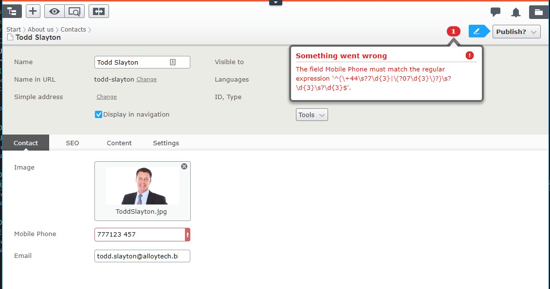
Try to help them along with examples of the correct input or a clearer error message.
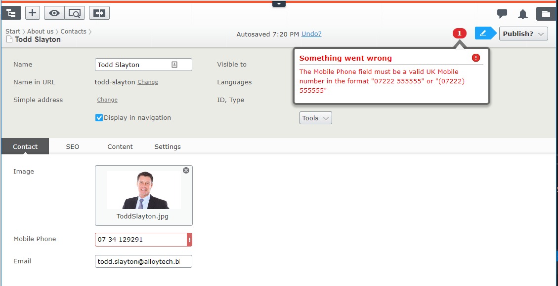
Again use localization here if you need to accomodate Editors in multiple languages.
Conclusion
I hope you found this useful and that importantly it makes you consider the experience of the Editors who use the site. If I missed something out that you find a niggling issue, drop a comment below.
Comments